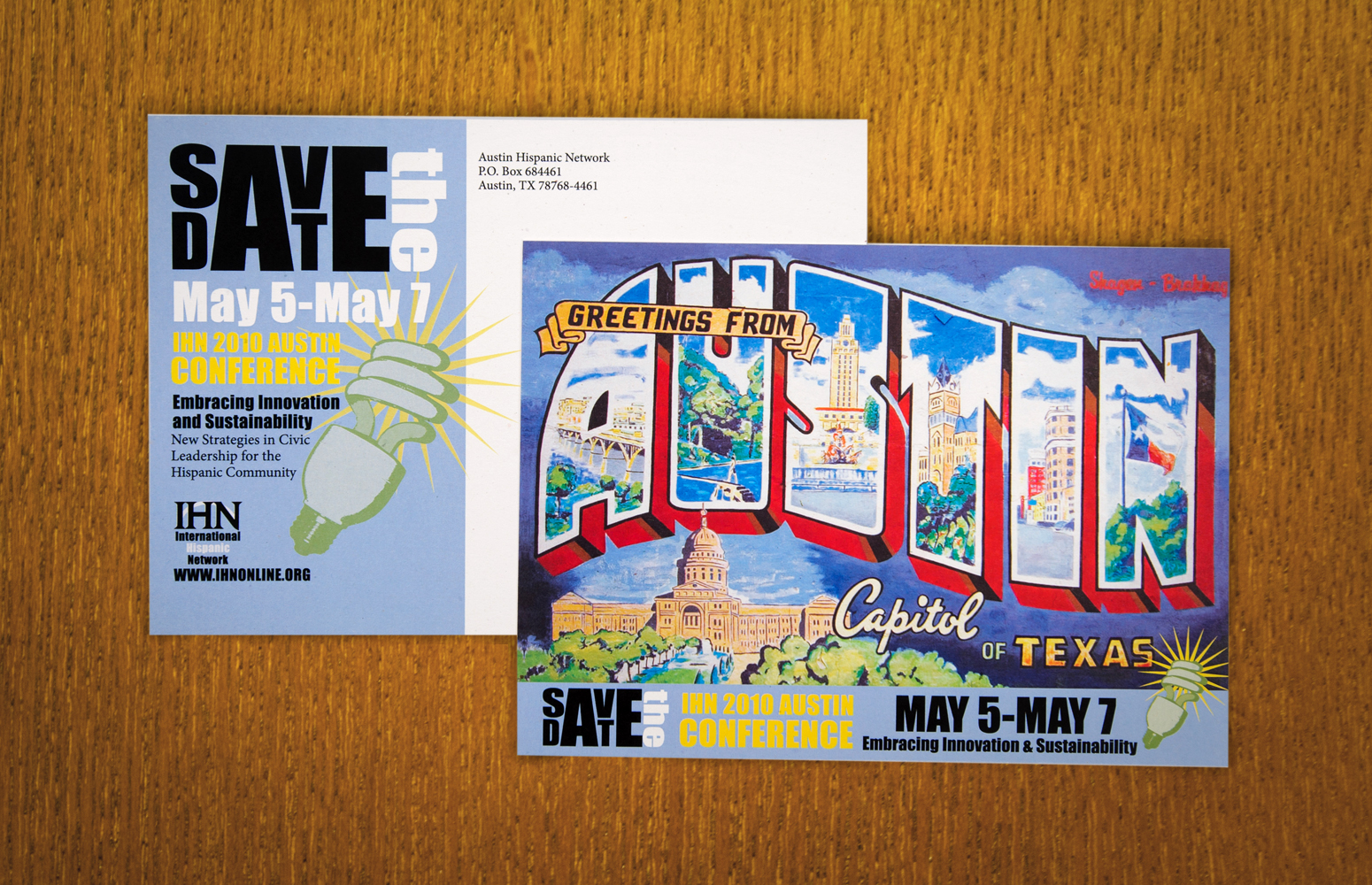
- Save-the-Date Postcard
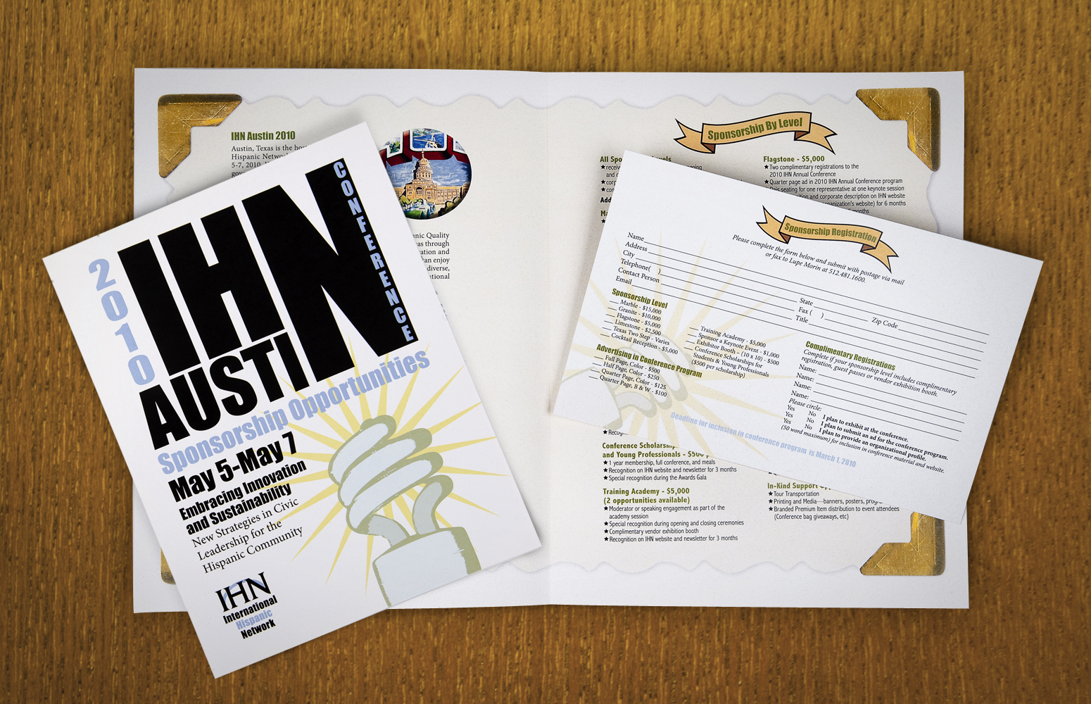
- Sponsorship Packet & RSVP
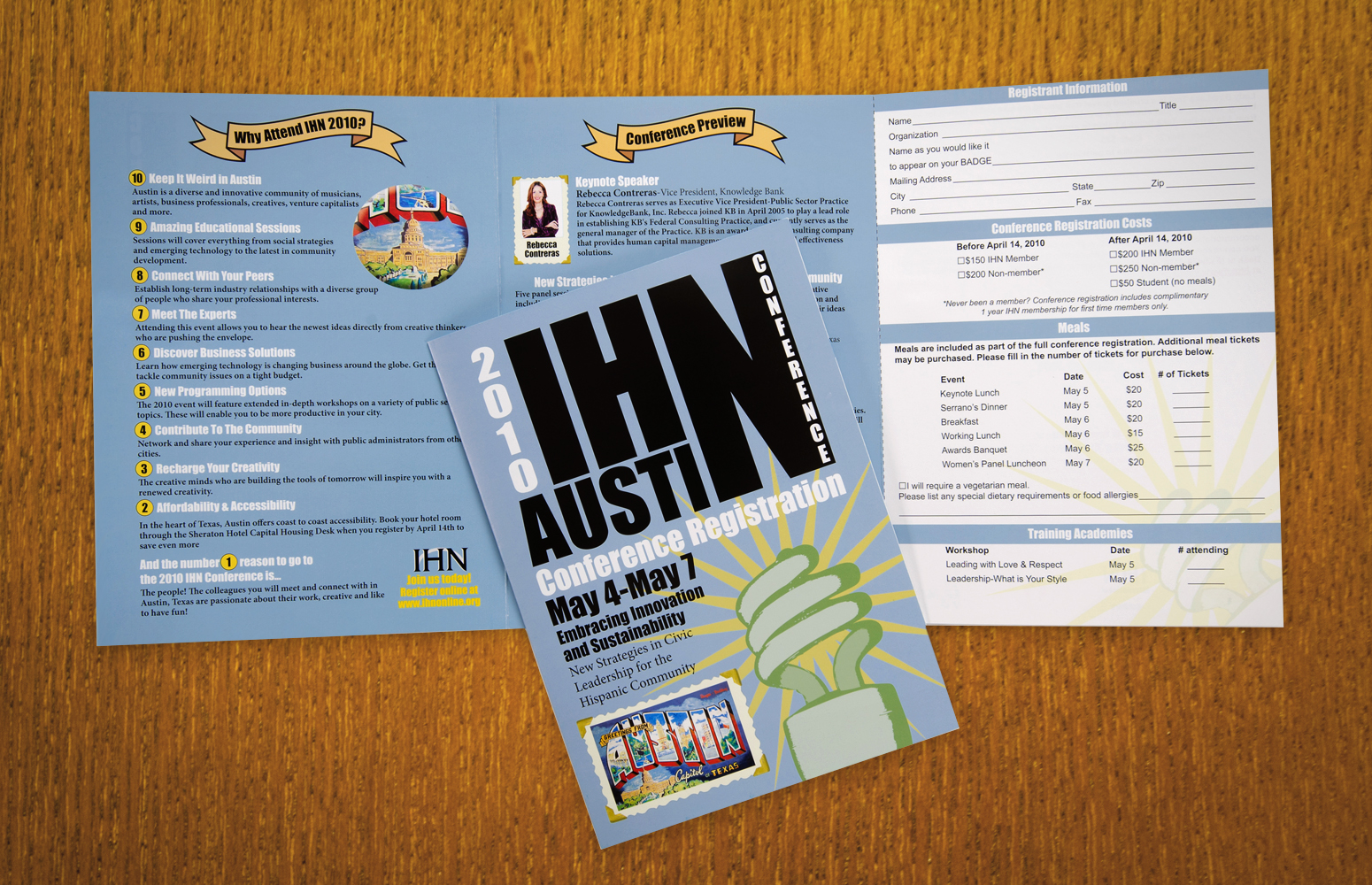
- Registration Self-Mailer
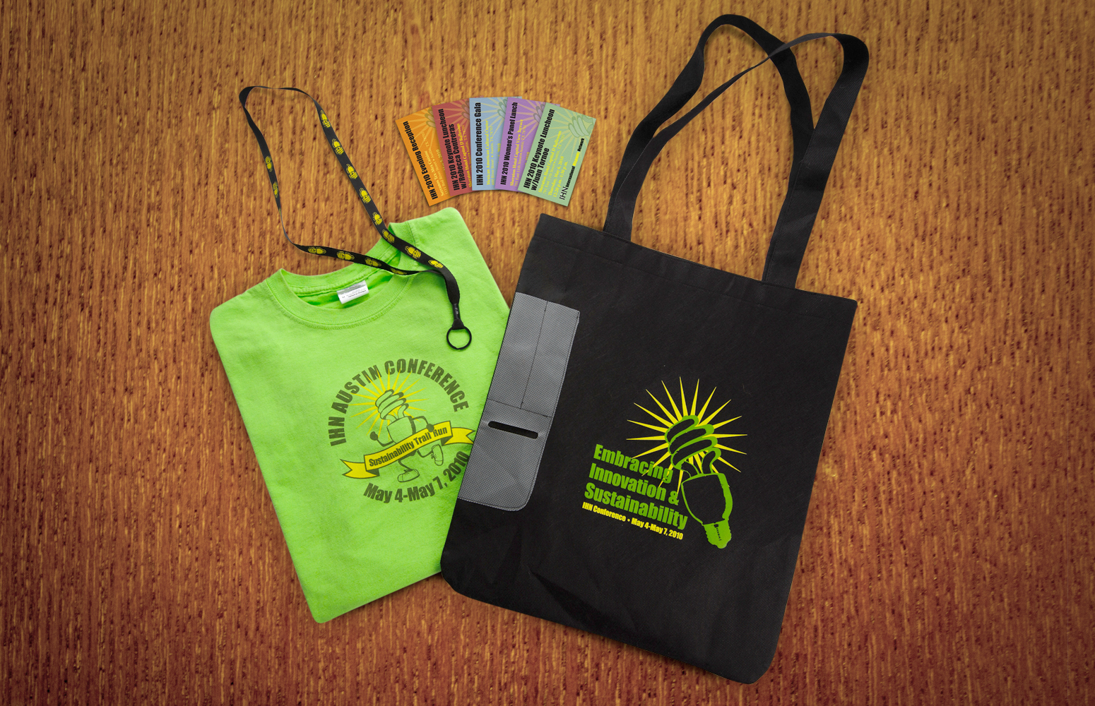
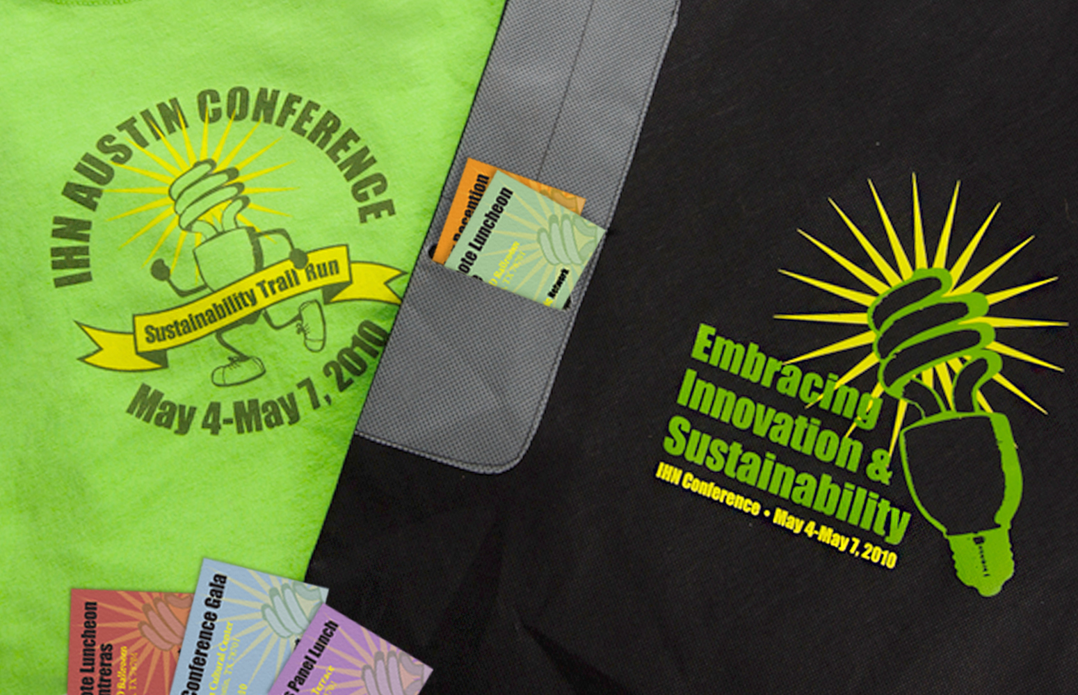
- Conference Merchandise
- Session Tickets
- Event Signage
"By far the best IHN event we've sponsored to date. I'm proud to have been a part of this team, and we couldn't have done it without the thoughtful creative talent. Thanks Christen!"
-David Juarez, Assistant Director, Austin Water
International Hispanic Network
2010 Austin Conference
Project: The City of Austin Public Information Office was tasked with planning and organizing a local conference for this growing nonprofit dedicated to Hispanic cultural preservation. The 2010 theme was sustainability and innovation. There was a vital need for graphic materials to promote and improve the event experience. At previous conferences, there had been complaints of difficult event navigation and disjointed collateral that caused confusion when registering. IHN wanted their out-of-state members to feel welcome, immediately get a sense of what Austin has to offer and be able to register painlessly.
Solution: I created a full visual identity for the conference, designing an array of announcements, registration materials, sponsorship packets, seminar tickets, promotional items and event signage to ensure the smooth operation of the conference. I incorporated the themes of sustainability and innovation into the graphics, while addressing the IHN's concerns regarding overall design and functionality. I introduced the familiar "Greetings from Austin" mural as many of the conference events would be taking place in surrounding areas. The public art piece served as an visible landmark to let visitors know they were nearby. I participated in all aspects of the planning and execution of the design work and ensured that all deadlines were met in a timely fashion.
Results: The conference was a huge success, and the graphics created for the event helped attendees schedule and navigate their activities with ease. The conference attracted national attention and was rated by participants as one of the best conferences ever held by the organization.
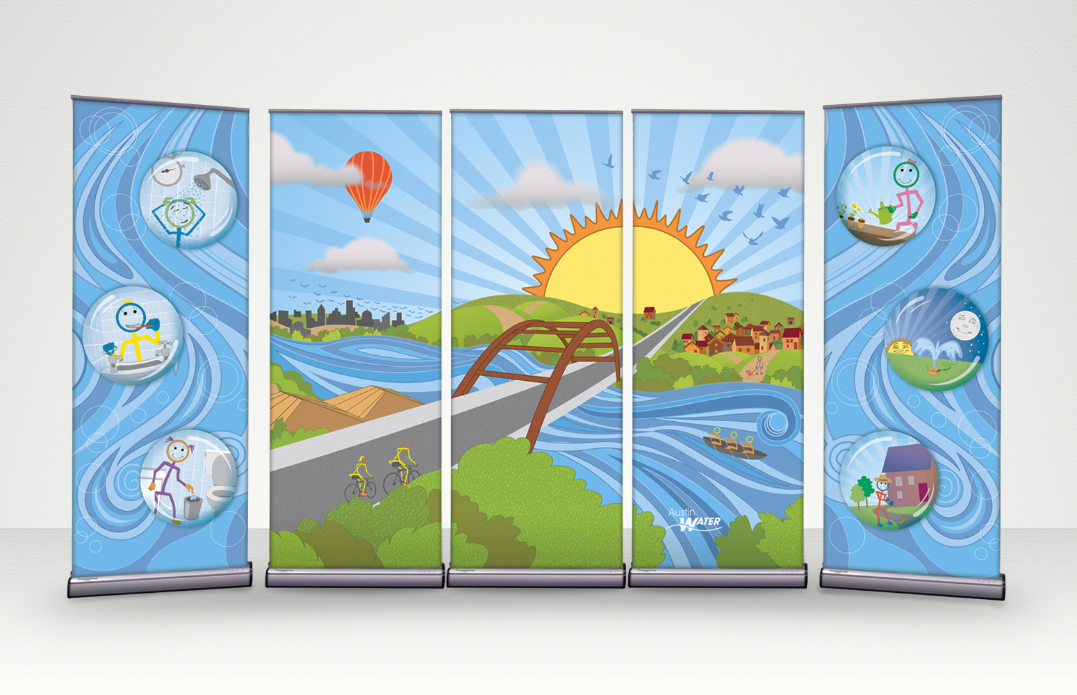
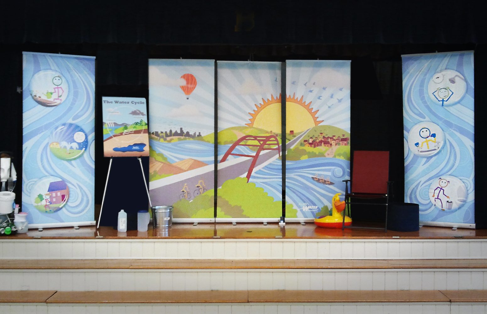
- Retractable Banners
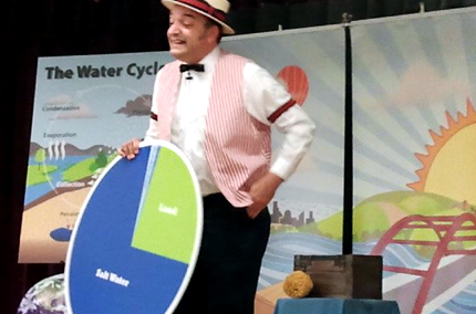
- Stage Props
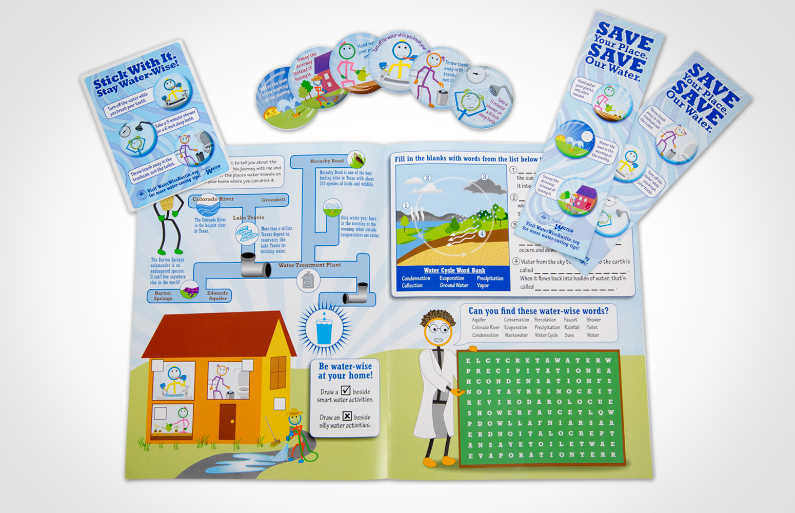
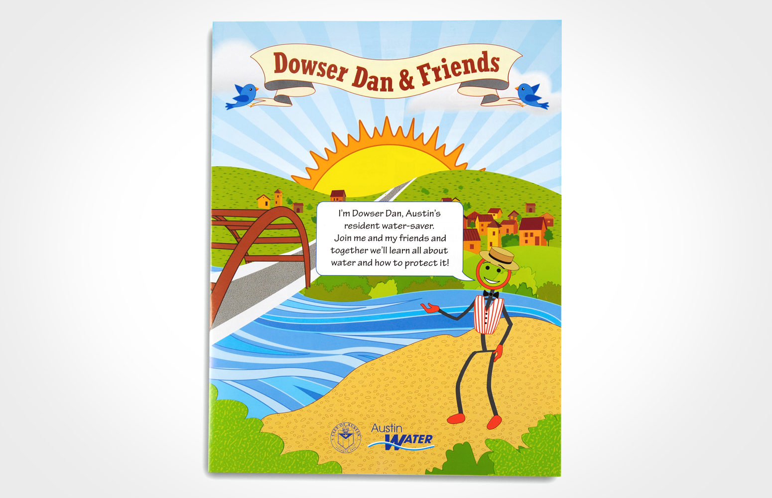
- Educational Gamesheet
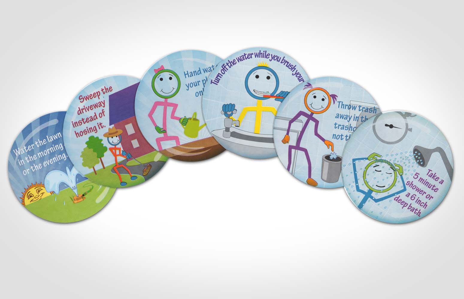
- Repositionable Stickers
- Waterproof Mirror Cling
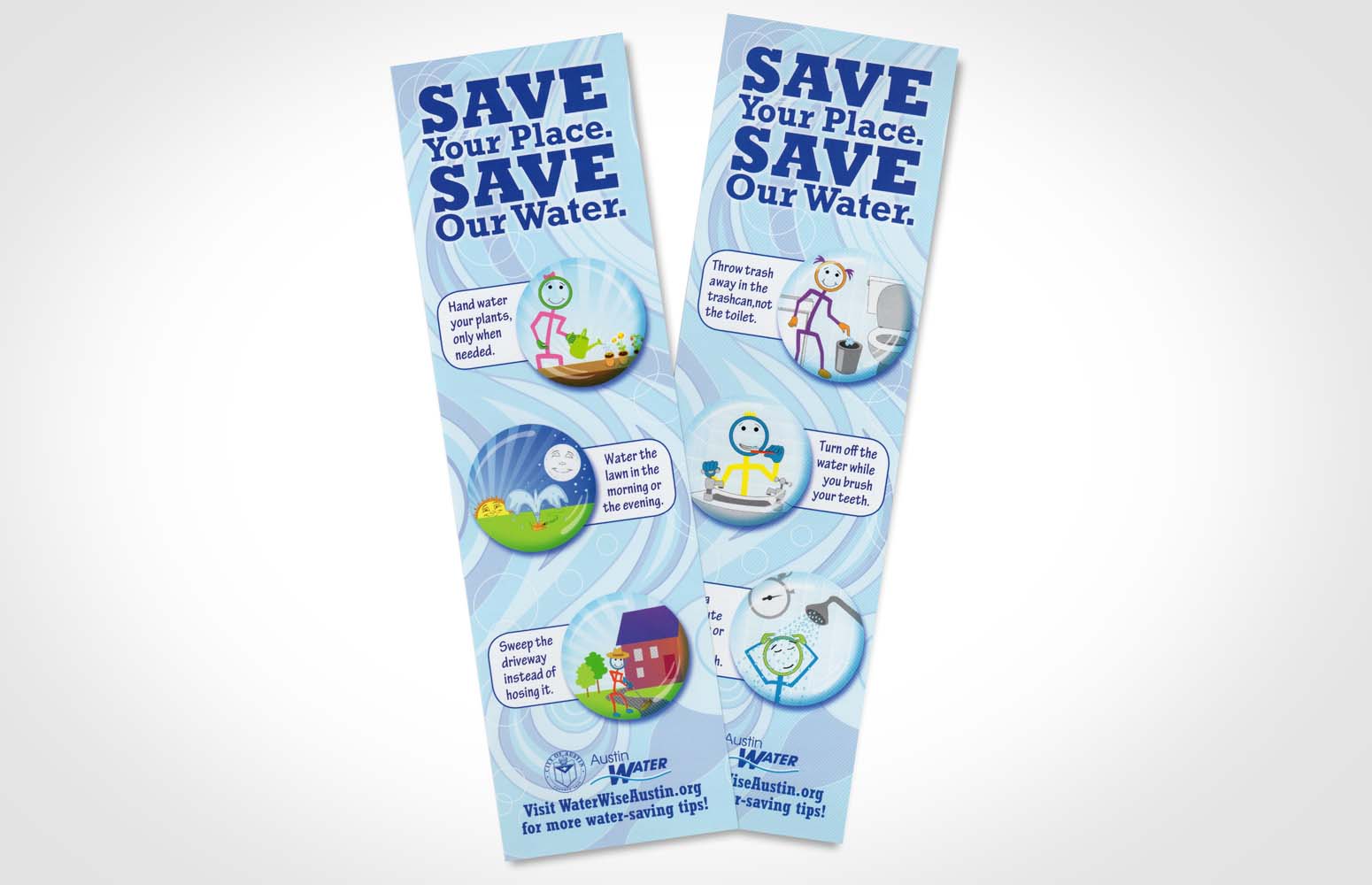
- Bookmarks
"Christen really WOWED us on this one! She did an amazing job tying in the former production nuances and evolving it into something both kids and adults can respond to."
-Geneva Guerrero, Public Information & Outreach, Austin Water
Dowser Dan
Educational Performance Series
Project: Austin Water wanted to revive their children’s performance series, Dowser Dan, in order to educate younger generations about water treatment and responsible water use. Updated handouts and materials were needed to match Austin Water's new focus on conservation. A solution to stage setup problems of the traveling one-man show was also needed.
Solution: I researched the series and revamped the concept for a more unified production. I developed a new visual identity based on their existing installations, the "Water People" (colorful people made of PVC pipe and arranged to show smart water use habits). I custom-illustrated retractable trade-show banners to facilitate easy transportation and setup and designed additional props to help the actor demonstrate the script’s concepts. I took the new graphics a step further, creating educational handouts and giveaway items for the audience members to use at home after the performance. All visual elements retained the message of a more ecofriendly and sustainable Austin.
Results: The banners are versatile enough to use as a backdrop in a variety of locations and spaces. They are used both in the performance and at other outreach events. The on-stage graphics introduce Dowser Dan in an eye-catching, appropriate manner and allow for interaction with the concepts demonstrated in the artwork. The props are colorful, fun and easy to use, and the related print materials are immensely popular, enhancing the learning experience for the young audience, their teachers and their families.
- Logo & Usage Concepts
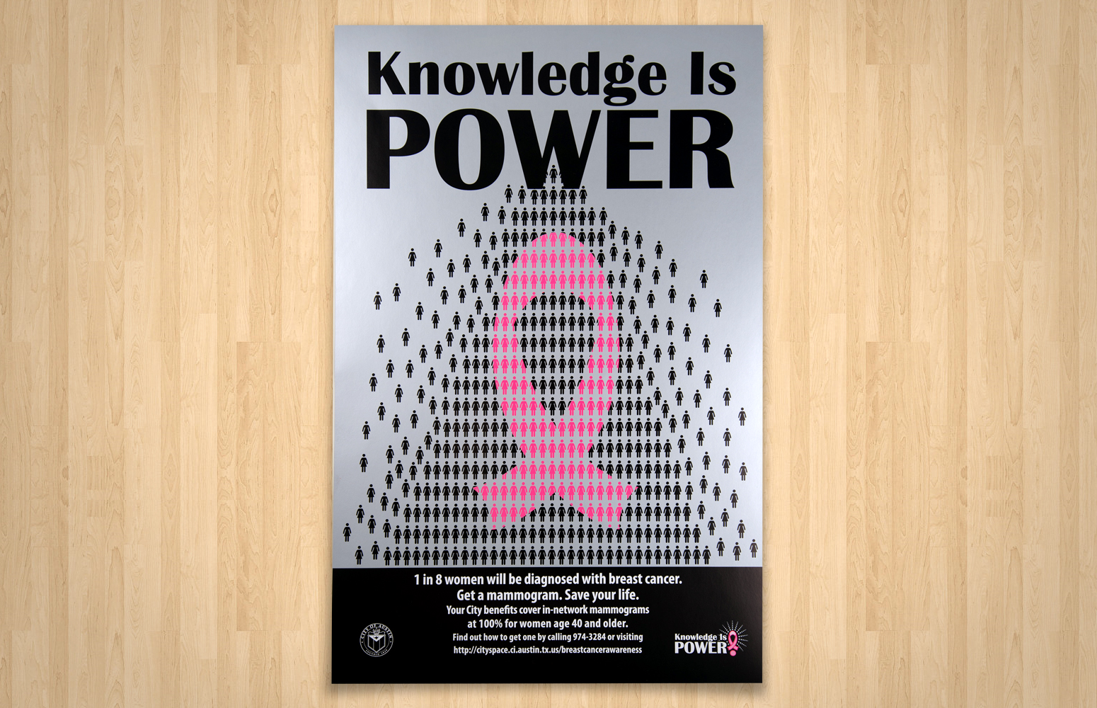
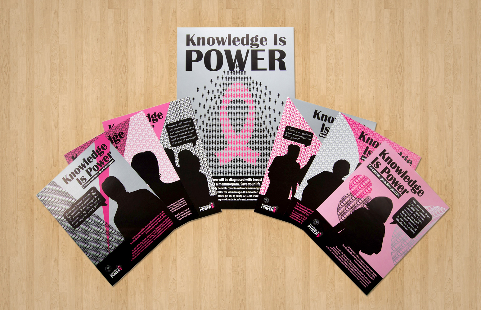
- Poster
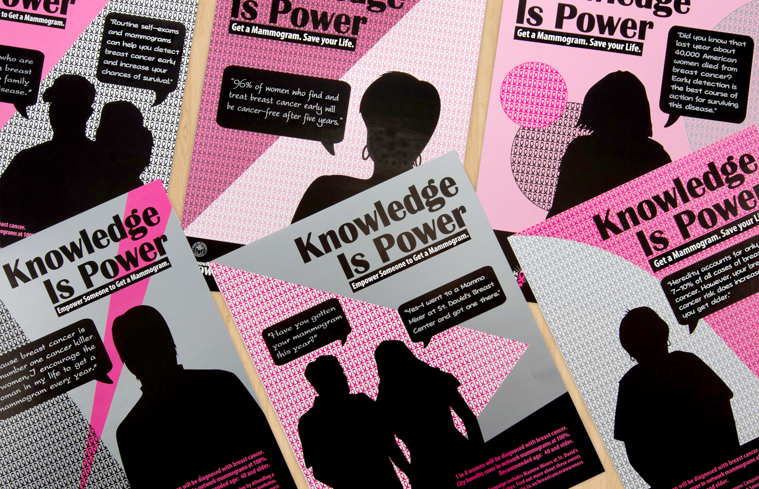
- Monthly Flyers
- Infographic Chart Display
- Promotional Giveaways
"Christen is extremely capable from a technical standpoint, but also very easy to work with ... she's provided us with something we can use forever."
-Clemmie Cummins, Wellness Consultant, City of Austin
Knowledge Is Power
Breast Cancer Awareness Campaign
Project: The City of Austin’s Wellness Program was in need of a logo, tagline and high-quality, attention-grabbing print materials to promote council member Laura Morrison's Breast Cancer Awareness campaign. Their goal was to encourage employees to take advantage of their health-screening benefits and to track participation throughout the campaign.
Solution: I created a versatile logo for display at press events, in newsletters, on promotional items and a variety of other campaign applications. I produced an array of branded materials for distribution to various departments in order to advertise the program. Posters and monthly flyers containing awareness-raising facts were displayed across City offices to catch the attention of passers-by. I also hand-mounted graphic chart displays that employed custom stickers as markers to track monthly participation.
Results: The logo solidified the campaign message. The informational posters and flyers are a timeless resource that can be used year after year. The graphic charts served as interactive components that were user-friendly and easy to read and that maintained the program’s overall look and feel. The City continues to use the logo and graphics in expanded applications to continue spreading the message of awareness.
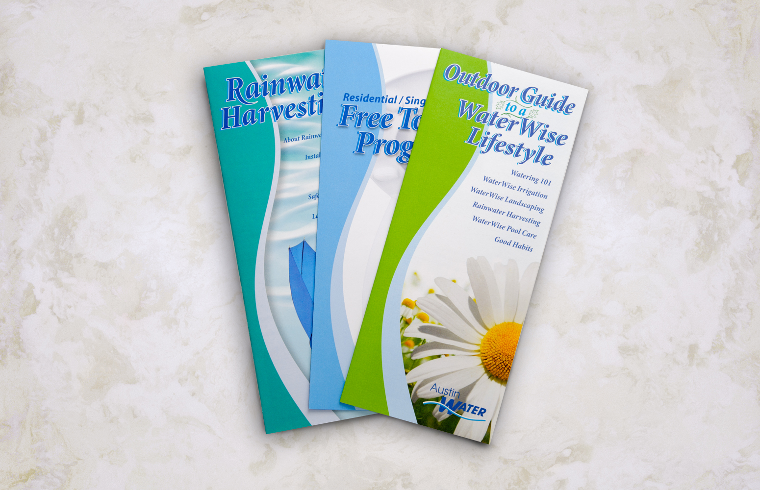
- Rebate Program Brochures
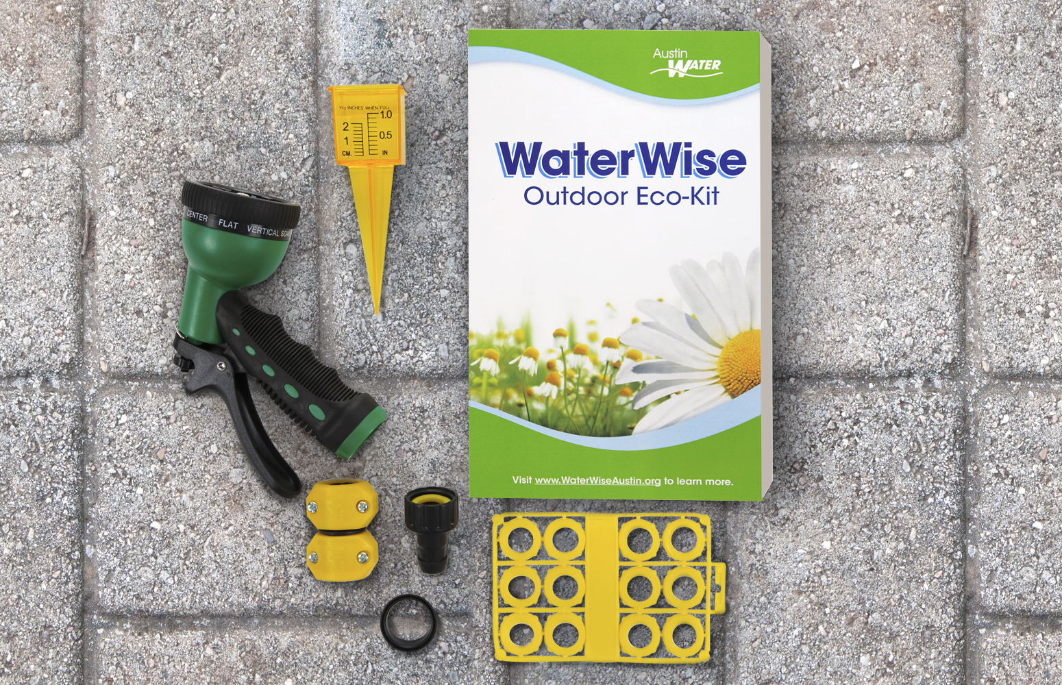
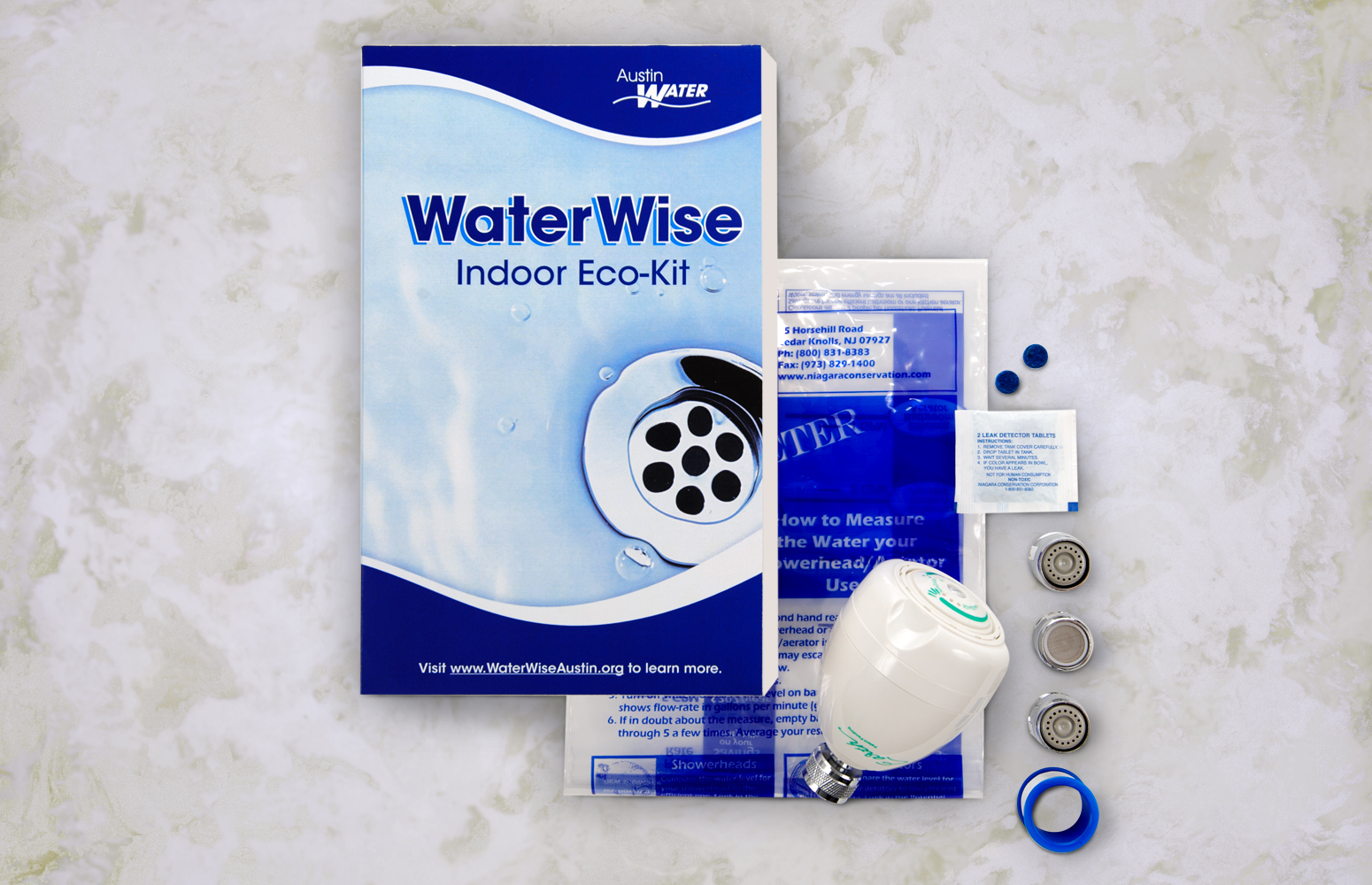
- Household Conservation Eco-Kits
- Conservation Tip Handouts
- Print Ads
- Web Graphics
"I've worked with a lot of designers, and Christen is among the best at taking a direction and incorporating feedback without giving in on important design principles. And she does it nicely!"
-Joan Ivy, Public Information Specialist, Austin Water
Austin Water
Rebranding & Conservation Campaign
Project: Austin Water requested assistance in creating a consistent visual identity to unify outdated public outreach materials, promotional campaigns and print collateral. With hot, dry weather fast approaching, there was a need to spread the message of water conservation, but the existing materials did not reflect the personality of the department and did not adhere to a recognizable brand. Fast solutions were needed to enhance their connection to customers. Their goals were not only to increase community involvement during peak water use season but also to foster a public commitment to responsible water use year-round.
Solution: I worked in conjunction with the Public Affairs team to conceptualize the naming, messaging and scope of the campaign. I audited the existing outreach materials, updated and reorganized data and edited content to provide a more accurate and appealing company image. I created professional, attractive print collateral, print and web advertisements, and a variety of supporting graphic items, including web banners, icons and signage. I also handled a wide spectrum of other activities in conjunction with the design process, including City purchasing procedures, photography direction and editing, copywriting and management of web content.
Results: Event- and season-specific deadlines were met while maintaining the new look and messaging of the company. The community became more involved in water conservation efforts and took part in programs and incentives to reduce water waste. Austin Water is able to highlight their dedication to responsible water use and enjoy public participation long after the initial campaign timeline. The department is greatly satisfied with the rebranding and is proud to have a recognizable message to distribute to the public.
- Door Hanger
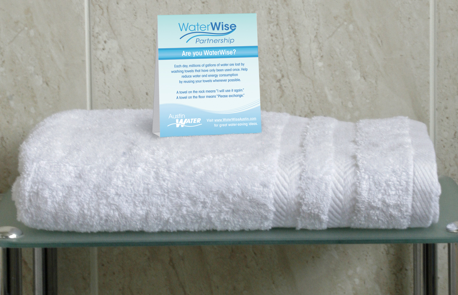
- Tent Cards
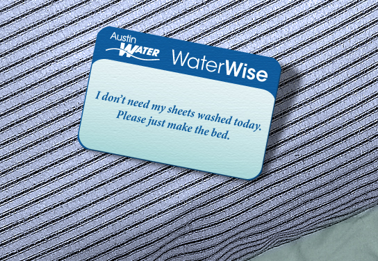
- Pillow Card
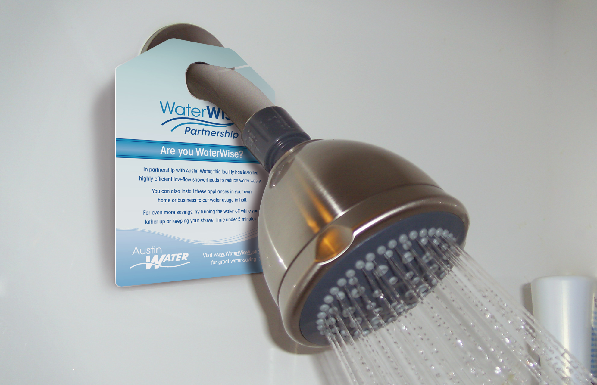
- Shower Hanger
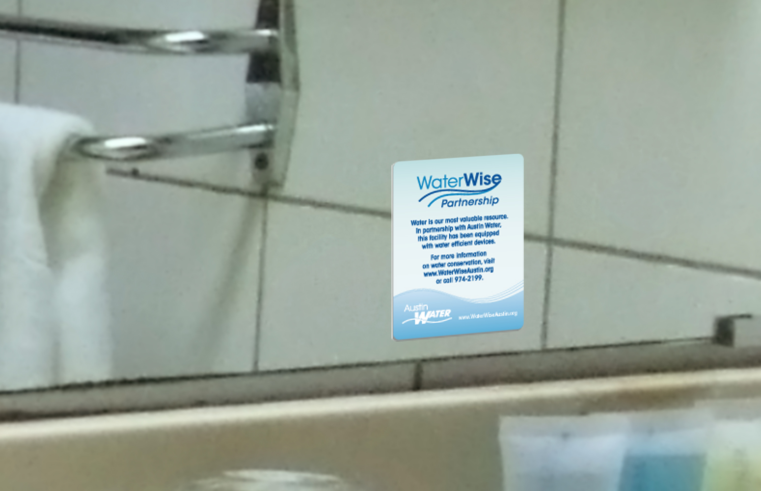
- Mirror Clings
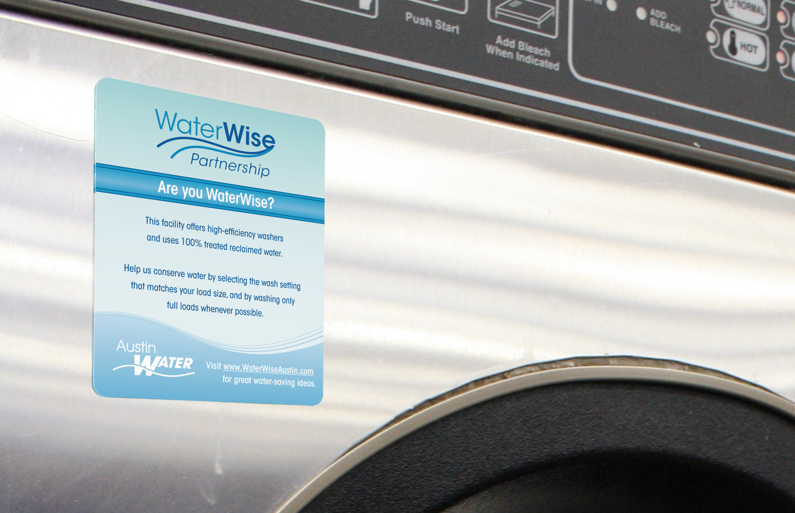
- Stickers
"Hotel staff was excited to learn about this program and eager to work with Austin Water staff to find ways to improve water efficiency at their hotel. Increasing efficiency conserves water while also lowering a hotel’s operating costs."
-Austin Water website, Hotel Partnership Program, City of Austin
Austin Water
WaterWise Business Partnership
Project: Austin Water's Conservation Office wanted to give local businesses incentives to save water. Beginning with City parks and properties and then spreading to hotels, motels, restaurants, car washes, Laundromats and other heavy water users, the goal was to raise awareness of daily habits and encourage the use of tools and appliances that reduce energy and water consumption.
Solution: With the help of the Conservation Office, a plan was developed to strategically place visual reminders and conservation tips throughout participating establishments to help both employees and customers integrate responsible water use into their daily practices. Table tents to encourage diners to forgo complimentary ice water if not needed, mirror clings to draw attention to water-saving sink aerators in kitchens and restrooms, shower hangers to promote the use of low-flow showerheads, reminder cards to encourage visitors to reuse towels and linens whenever possible and various other display items to served as a marks of partnership in water conservation.
Results: Since presenting the action plan, City parks and public recreation areas have begun incorporating faucet aerators, low-flow showerheads and dual-flush toilets into their facilities. Dining establishments have begun to limit unnecessary water service and incorporate water-efficient devices into their businesses. Kitchens, Laundromats and car washes are becoming more aware of water- and energy-saving appliances and are taking advantage of incentives to replace older equipment with smarter equipment.
- Art Direction/Project Management
- User Interface Wireframes
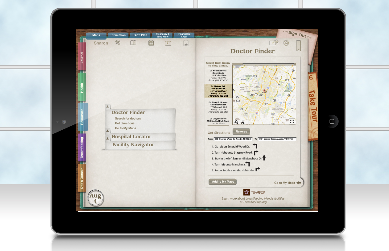
- Screen Designs
- Social Media Badges
- Illustrator & Photoshop Templates
- Video Presentation
"[Christen] took a project that had too many directions to count, provided brilliant design concepts and thorough guidelines to the design team with feedback that was always professional, informative and clear... and materialized attractive user interfaces that excited both the client and end users who were tested."
-Michael McGar, Owner/Creative Director, Michael McGar Creative
Texas WIC
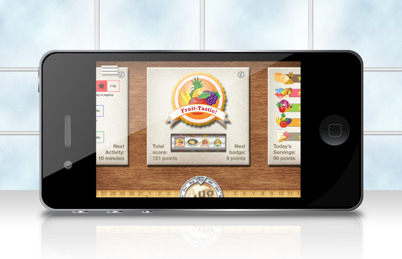
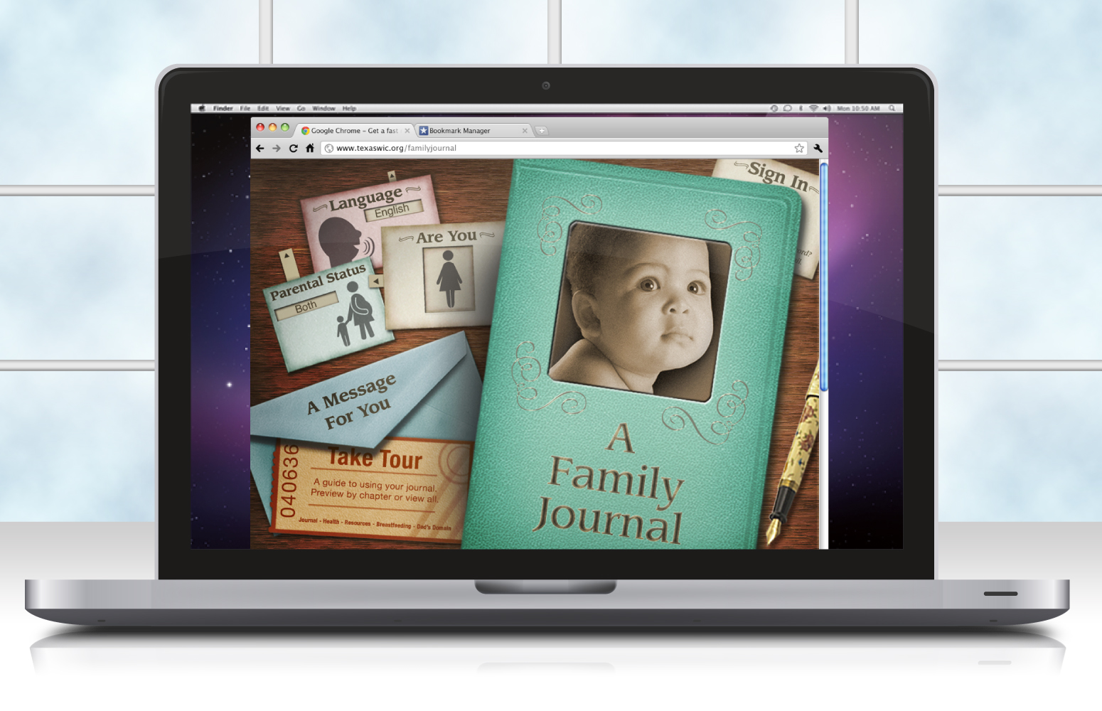
Family Journal Application
Project: In partnership with Texas WIC, a government nonprofit agency, a team of skilled design students gathered to conceptualize and design a cross-platform application for computers, smartphones and tablets. The goals were to digitize existing tools for expectant and recently delivered mothers, enhance data collection capabilities to help WIC better serve its clients and to encourage behavioral change through game mechanics and social media integration. The added challenge was to meet this goal while targeting multiple audiences: Texas state upper management, immediate WIC staff and WIC clients.
Solution: I worked closely with the team to ensure that all deliverables were provided on time and that the design process ran smoothly. I organized data for detailed flowcharts and wire-frame creation and used my artistic sensibilities to set graphic standards and guidelines for production. To maintain quality control and brand consistency despite a wide range of team member skills and capabilities, I created tools and templates for the students to employ and provided clear, thorough instruction on how to use them. Even while designing my own sections, I continued to provide feedback to the team and remained responsive to their feedback to ensure that all input was given value and attention.
Results: The great attention to detail ensured that there were no gaps in the presentation of information architecture to WIC representatives. Despite losing some team members along the way to personal emergencies, I stepped in to help solidify all the components into a unified whole. There was no sacrifice of thorough planning to facilitate a successful interactive design, staying focused on the user experience as a whole. Both the WIC representatives and the end users who were tested could not wait to get their hands on this application.

